Typography matters: How it can attract your target customers

ඩිජිටල් සහ තාක්ෂණය
සතියකට පෙර 205 — අවම 9 කියවීම
Content is everything whether you sell a product, share life experiences, or express an opinion. It changes the lives of humans and presents the author’s perspectives based on tone, message, and meaning. Information creates better interest through quality content that triggers the audience to ask for more. But in order for content to be effective, your headline needs to be eye-catching which makes it different from the other content. That’s where typography kicks in.
Typography and why it matters
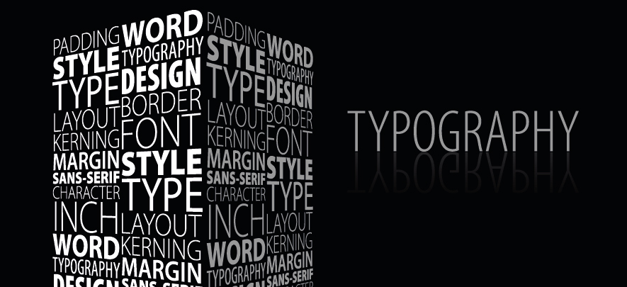
Typography is a set of words based on a topic, that are visually engaging through the sense of style and appearance they present to a reader. It creates an emotional connect to get your reader’s attention by emphasizing the ideas that stand out from the rest of your topic.
It delivers the first impression through visual content making it easier to digest in remembering what information you are providing to the reader. Typography is an important tool in creative design, especially in branding because it essentially builds a bridge between human emotions through the company and the customers.
Typography in global industries
In content marketing, typography isn’t about creating a good headline. It provides awareness of how a message can be beneficial to customers. A good example is promotional ad campaigns.
In order for a company to make a profit through products, the marketing department needs to plan on how to execute a campaign that provides their unique proposition towards customers through creative advertisements.
By highlighting a message through typography, it helps the readers understand what your product wants to say. It also provides an emotional connection to the readers because typography can blend to the visual that looks like it is a part of the product.
Typography influences human connections
Typography also works in building emotions. It creates an emotional impact on humans because they need to deliver a strong message about what is happening in a certain environment. Humans are sensitive emotional beings. It drags them where a certain message can bring impact to their lives, whether positive or negative before they act upon it.
Take a good look at this simple poster campaign for an environmental organisation. The goal is to promote global awareness of what is happening to the world without sending a compilation of papers to people. The message is simple because you know it when you see it. Through visual image and how a typographic message adapts to the subject makes a perfect sense of brand awareness.

Image source: Pinterest
Typography in data visualization
Data and research are important yet very boring to read in any business presentation. It always happens when you want to state a factual result that makes the reader trust the information because it serves as a basis that happened in a recent event. Typography can help you simplify all that gathered information by getting accurate results in a more engaging and fun approach to the reader’s interest.
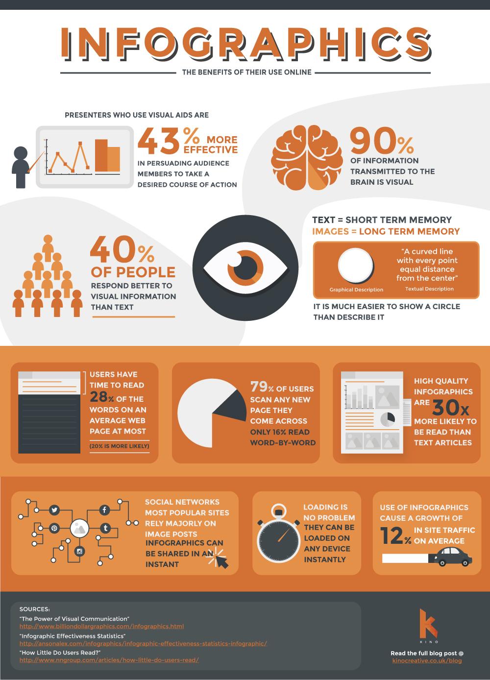
A great example of typography comes into infographics. Infographics are graphical representations of information that are easily readable and quick to digest. Usually, infographics are used in creating a progressive reports of company's growth and status in a specific month or a conductive survey that supports factual data in a certain behavior or status through patterns and trends in an environment. Typography with a supporting body copy and graphics helps the information minimize the reader’s effort and time in understanding the author’s intent about the gathered data given.

Image source: Responsive Infographics - The Benefits & Our Infographic Work - Kino Creative
Typography in websites
Everything is digital and so is advertising. The first thing that is important in getting your attention is big headers that attract attention. Typography is very important in websites because it creates a line on how you break a sentence to what is more important to read. Call to action, as an example, is a small portion of content that encourages the consumers to know more about your brand or guide you on what to do next. Most calls to actions are designed well to capture reader’s interest, typography is effective even if the arrangement of text is just plain simple.
Make a message work
So how to create an effective typography? Creative designers look at these simple guides as their reminders before they start working.
-
Identify your font usage
In typography, there are two groups of texts you need to understand: Typeface and fonts. Typefaces are a collection of font that is grouped as one while fonts are similar typefaces that are presented according to their weights, appearance, and styles. And for every typeface comes with its kinds: The serif, sans serif, and the decorative. Now you understand what typeface and font means, you should know what to use and how to use them.
-
Review your brand guideline
Brand visual guidelines are a guide of standard visuals to follow for one's brand identity. It tackles specific elements and core values in a system on how a certain branding works based on the company’s core values and mission. Once you get to review the brand guideline of the business you are working with, it is easier for you to use an appropriate font and make a consistent execution of designs in a matter of time.
-
Purpose first, design later
Creating a typography can be personal based on how you feel about a certain project and where to start, so is working with clients. Designers usually read a creative brief to know what the message means before they work on typography. What is the nature of the industry? Always do basic research and the background of the business you are doing and ask yourself: Who am I designing for? What does the intent of the message to convey to the public? Does the message relate to my design? How am I going to execute it without adding too much? A design works with less visual because the goal of creating your design is the purpose and not the execution.
-
Check your spacing and kerning
Although typography makes the most headlines out of a body copy, you need to step back to look at the appearance of your texts. In most cases, other default fonts have a wide kerning between each letter, and its looks do not appeal to the eye. Spacing, on the other hand, can create and add too many gaps between words that don’t work well in the design. Be mindful to look at how you construct the typography in a well-aligned manner or else, you don’t want to see a crooked word messaging spread across media platforms.
-
Be inspired
Internet is free and so is browsing. You can get a ton of inspiration in your digital background to get that typography creativeness going. Designers love to get inspiration in websites like Behance or Dribbble where you can find so many artworks if you get creative block and don’t know where to start.
But here’s the tricky thing. Most designers try to copy the whole idea, you don’t know what’s your difference between yours and theirs. So here’s the idea. If you’re just starting to digest everything, try to find how-to-typography tutorials but don’t copy all of it. Instead, understand how they do it to reach the results you are seeing in the video or image thumbnail. Once you get how they do it, it’s up to you how to expand that idea in your own pace but the method of execution is as same as in the tutorial. Make sense? Method of execution is your form of adapting while the idea is yours.
-
Experiment and have fun!
Once you are ready and have answers in your mind, just create and have fun! This is always where you discover so many methods you can do to release that imagination of yours and put it into a canvas. Your idea is limitless so creating a good typography isn’t difficult for you when you know what you’re doing. Once you’ve done it, you will see how far it can take you and share it with the world.
Typography is fun to do and you can get so many inspirations on the internet to start. When you get the basic steps, you will be able to deliver creativity that works.
Also read: Power of content: How to generate traffic to your eStore using content
To explore business opportunities, link with me by clicking on the 'Connect' button on my eBiz Card.
Image source: shutterstock.com
Disclaimer: The views and opinions expressed in this article are those of the author and do not necessarily reflect the views, official policy or position of GlobalLinker.
විසින් පළ කරන ලදී
Rafael Renzon PayumoAfter series of discovery and exploration, I am extending my network to share what I do and how I do it in my process. I'm an independent designer based in Caloocan,...
Rafael Renzon ගේ පැතිකඩ බලන්න
SME අභිප්රෙරකයන්
Rafael Renzon Payumo විසින් ලියන ලද අනෙකුත් ලිපි
මේ සතියේ වැඩිපුරම කියෙව්වේ
ප්රවණතා
Mindful Eating: Enhancing Wellness and Productivity in the Workplace
Health & Lifestyle සතියකට පෙර 22
Economic Overview: December 2023
Economy සතියකට පෙර 50


අදහස්
මෙම අන්තර්ගතය බෙදා ගන්න
කරුණාකර ඇතුල් වන්න හෝ ලියාපදිංචි කරන්න සාකච්ඡාවට එක්වීමට